Keep It Down
Design Thinking Studio Project
Context
Keep It Down is a ten-week group project for Design Thinking Studio at University of Washington Global Innovation Exchange(GIX) during 2019 Autumn quarter. We were given 3 topics and asked to pick one and use design thinking as a tool to find a problem and solve it. As a team of 3, we went through stages of the design process including: identifying the problem, investigating, generating requirements, ideating, prototyping, evaluating and producing a solution.
Team
Team Hard Hat
Codes Gagnon, Lu Wang and Yi (Justice) Zheng
My Role
No official role was assigned in our team. Since all team members are coming from engineering and technical backgrounds, we divided every process evenly into three and we all contributed to this project from different perspectives. I contributed a little more from design perspective as I had some experience in design.
Design Question
How can we help office workers from suffering distractions due to noise pollution in open office layouts from 9am to 5pm on weekdays?
Reason
As you can see, our team name is Team Hard Hat, because our initial topic we decided was noise protection for construction workers. After our class presentation, we learned we had an issue with getting access to construction sites. After discussion, our team decided to pivot our idea and choose the space that would be easily accessible.
Since the open office is very common in the U.S and it is very easy to get in an open office to observe and get in touch with people who work in an open office. We then made our decision to choose open offices as our space to explore the noise problems.
Secondary Research
While doing our secondary research, we used UW Library search as well as Google as our tool for research and we found the reason why open office is so popular here in the U.S. is not just for better communication or being innovative, it mainly because it can help companies save money by reducing the square footage each employee requires them to lease. But this kind of office layout also brings some noise concerns for employees. Harvard Business Review mentioned that
“The open office can be a nightmare, especially when you’re working on something that requires your undivided attention”.
Although many companies provide specific measures to reduce the noise impact, the issue of noise in open office layouts persists. In this project, we hope to identify requirements to solutions of noise in open office layouts.
“In fact, it is said that offices with no walls or even low-walled cubicles can reduce employee productivity by about 15%” -Borzykowski, B. (2019). The solution for open office frustration
In addition, we also did a large number of research on noise. We aimed to find what kind of noise is most distracting for office workers. It turned out that
“continuous noise from machines, ventilation systems and conversations with limited information are not as distracting as the more harmful less continuous noise and noise with more information content” -Goenner, M. E. (2017). Generations in the open office plan
which make sense because human brains have to process the information they hear and that’s the main and they cannot process everything at the same time. Thus people will get distracted when they hear noise with more information content like people talking.
What I’ve learned
UW Library Search is very powerful and helpful for research, it can help us get access to some previous research papers which might not be accessible from direct online search.
Also when doing secondary research, we should not only consider the problem itself, we should also think about the user groups and our accessibility to those groups. In other words, we should think about “are we the right people to solve the problem” before jumping into the problem.
Primary Research
Field Observation
After secondary research, we refined our design question to focus on workers in co-working spaces. Our field study aimed to get more ideas around if workers in their co-working space with open office layout would be distracted by noise, how they respond or react to noise and what noise mitigation solutions already exist in these spaces. We conducted observations on three different co-working spaces, located at CoMotion at the University of Washington which all utilize an open office layout. Thanks to one of our team member Cody who reached out to UW CoMotion, we were allowed to go to all three UW CoMotion Labs for our field observation.

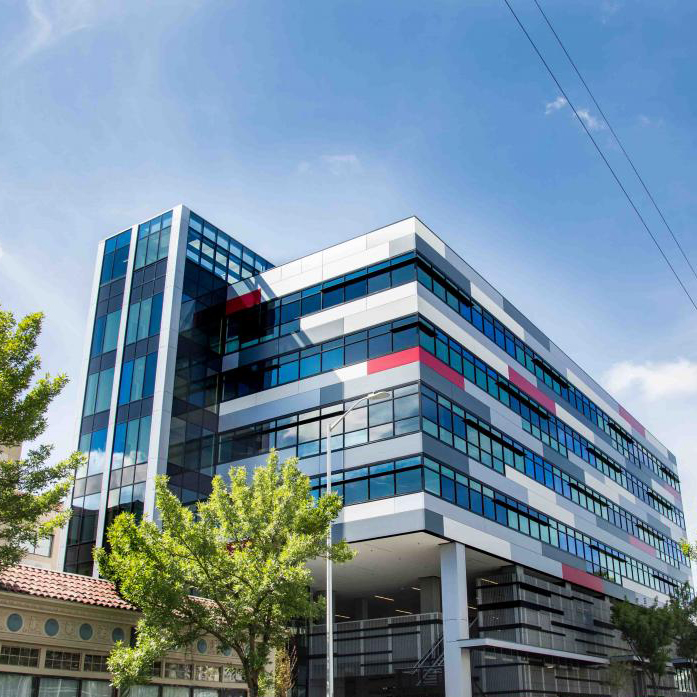
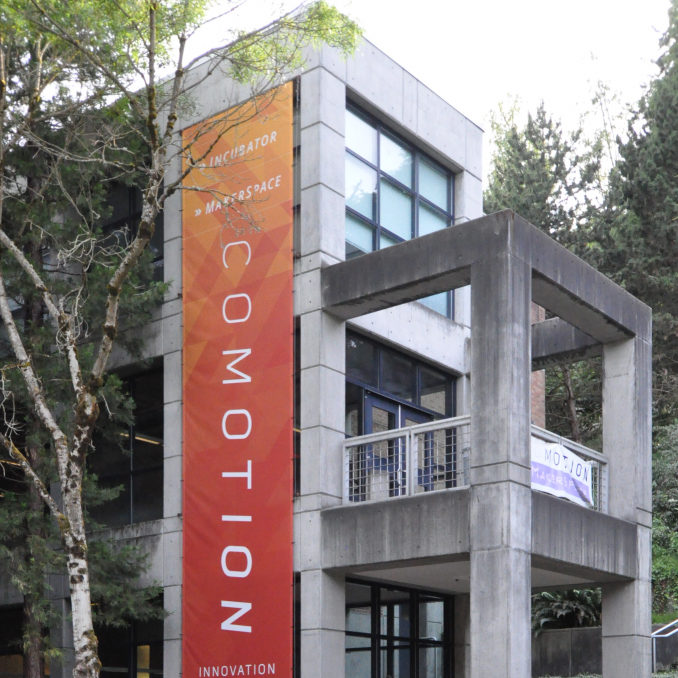
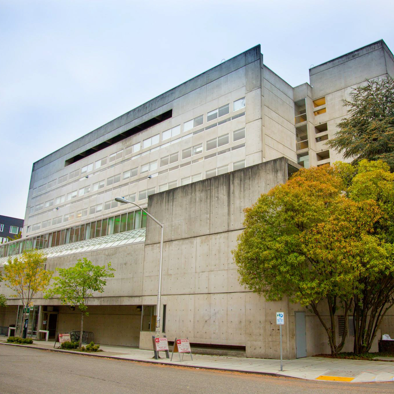
In each space we were assigned to our own desks located in different parts of the space. We sat and observed from these vantage points for 30 minutes per each coworking location. During this time we used a dosimeter to measure the noise level during our observation. The three locations we observed were Fluke Hall (life sciences), the HQ (virtual reality/robotics), and Startup Hall (software development). Note that the layout of the Fluke hall is a little bit different when we observed, since they wanted put more desks in that space.
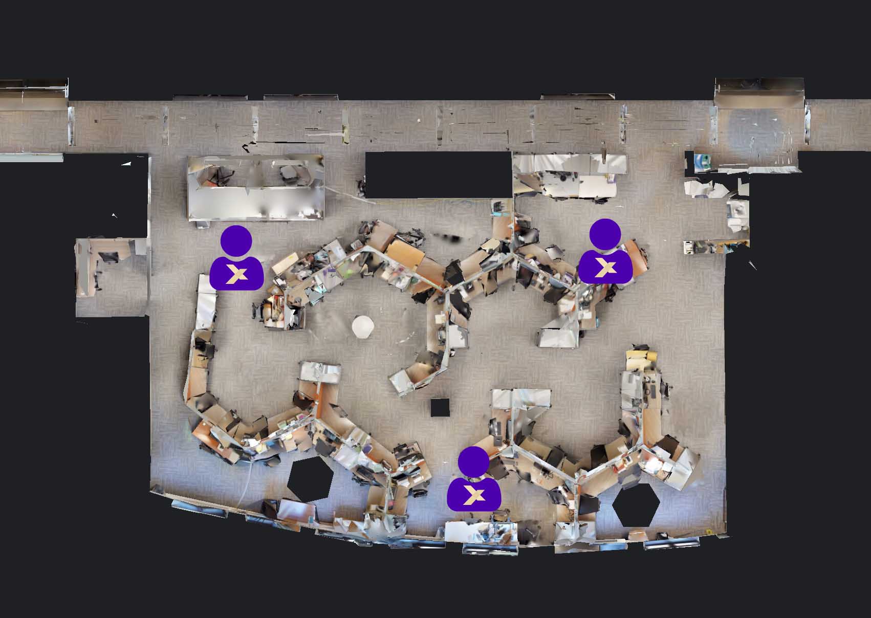
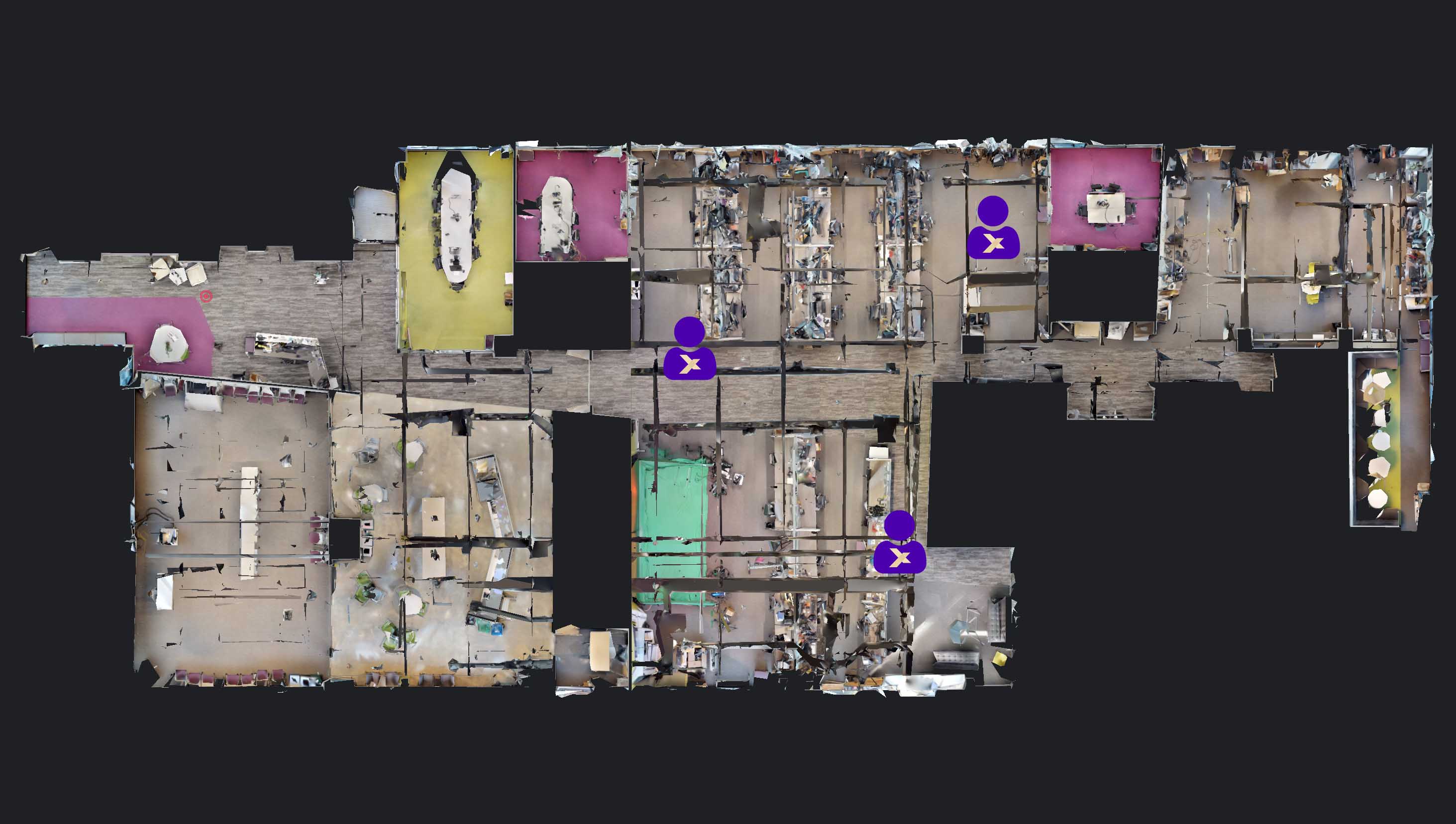
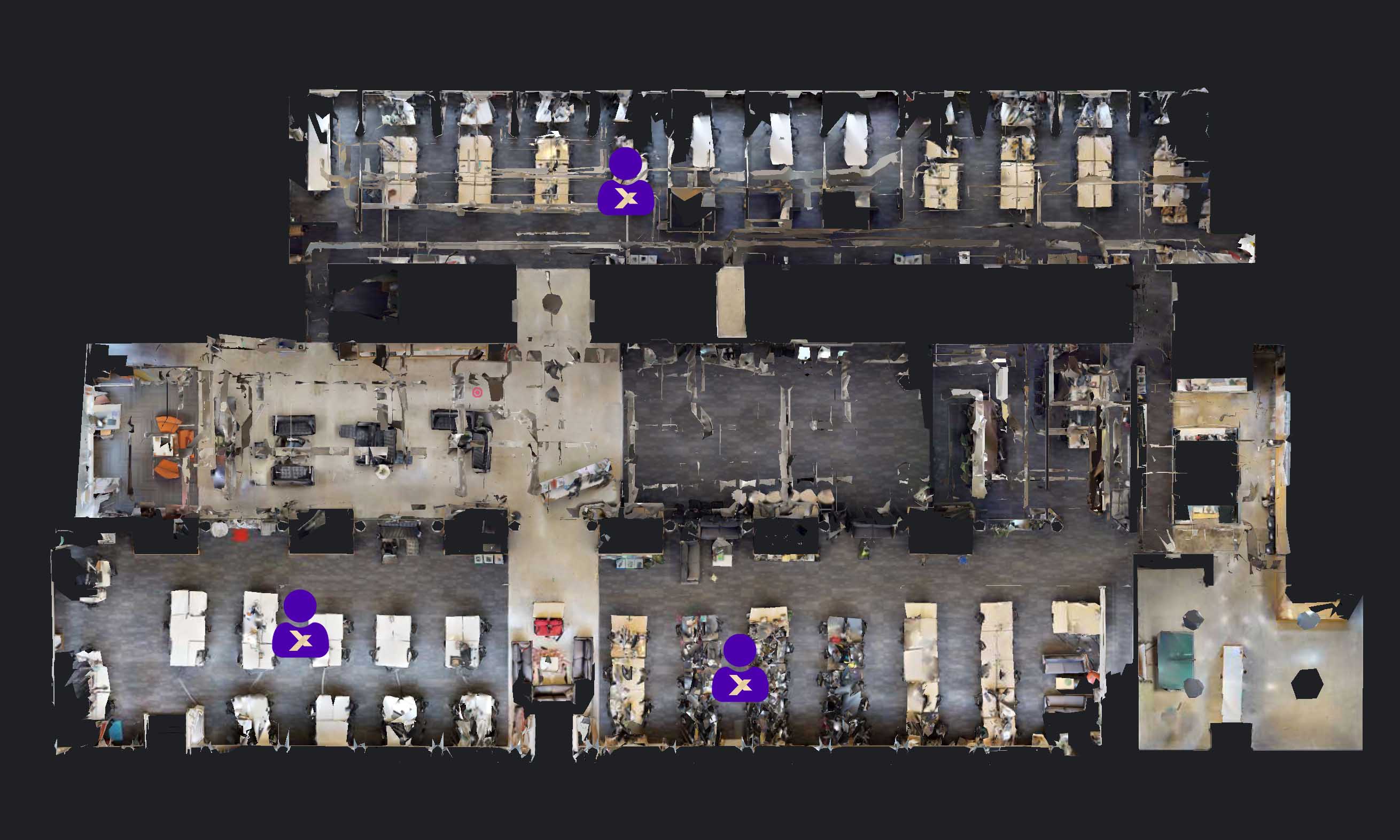
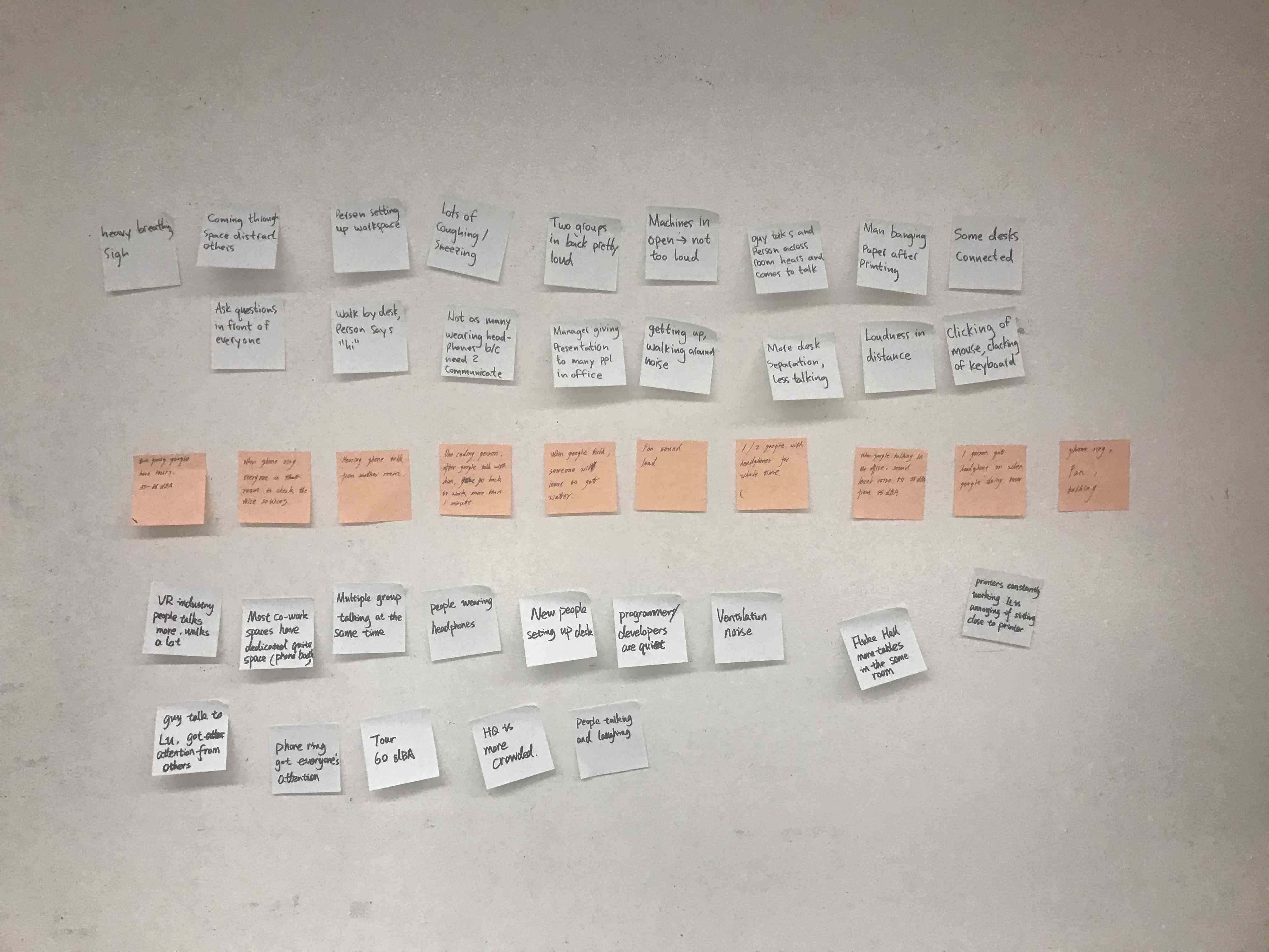
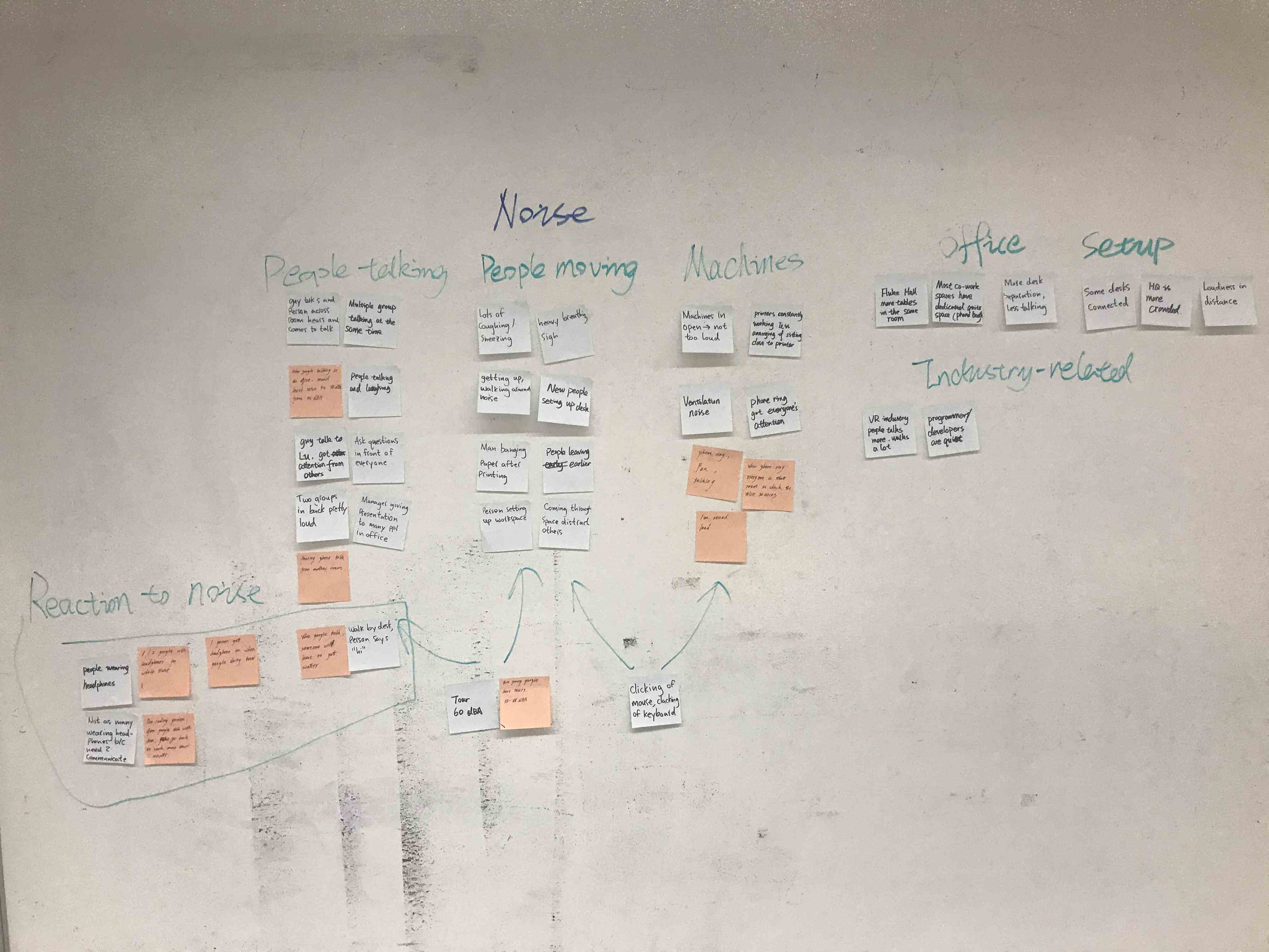
From our observation, we found that there are many items and behaviors which can be distracting in an open office layout including keyboards, phones, talking, etc. So basically anything an employee interacts with could be a distracting thing for another employee. We also found that people have their own ways to reduce distracting noise like headphones, avoiding typical office hour or using quite space.
Survey
In addition to our field study, in order to get more information about how noise affects workers in open office layouts, we conducted a survey comprising 12 questions which were asked to a variety of users in our target market. This survey went out to communication channels for CoMotion’s Slack indirectly from us (where managers posted the survey) and was also sent to some traditional office workspace users we knew. Most of the workers who took the survey were working in an open office layout and some weren’t. While we’re doing our scoping for the survey we decided that having the traditional office workers would be a good idea since it would allow us to get more information to compare against the open office layout. By getting this information we’re able to better understand the trends for open office spaces and if these issues persist into the traditional office layout.
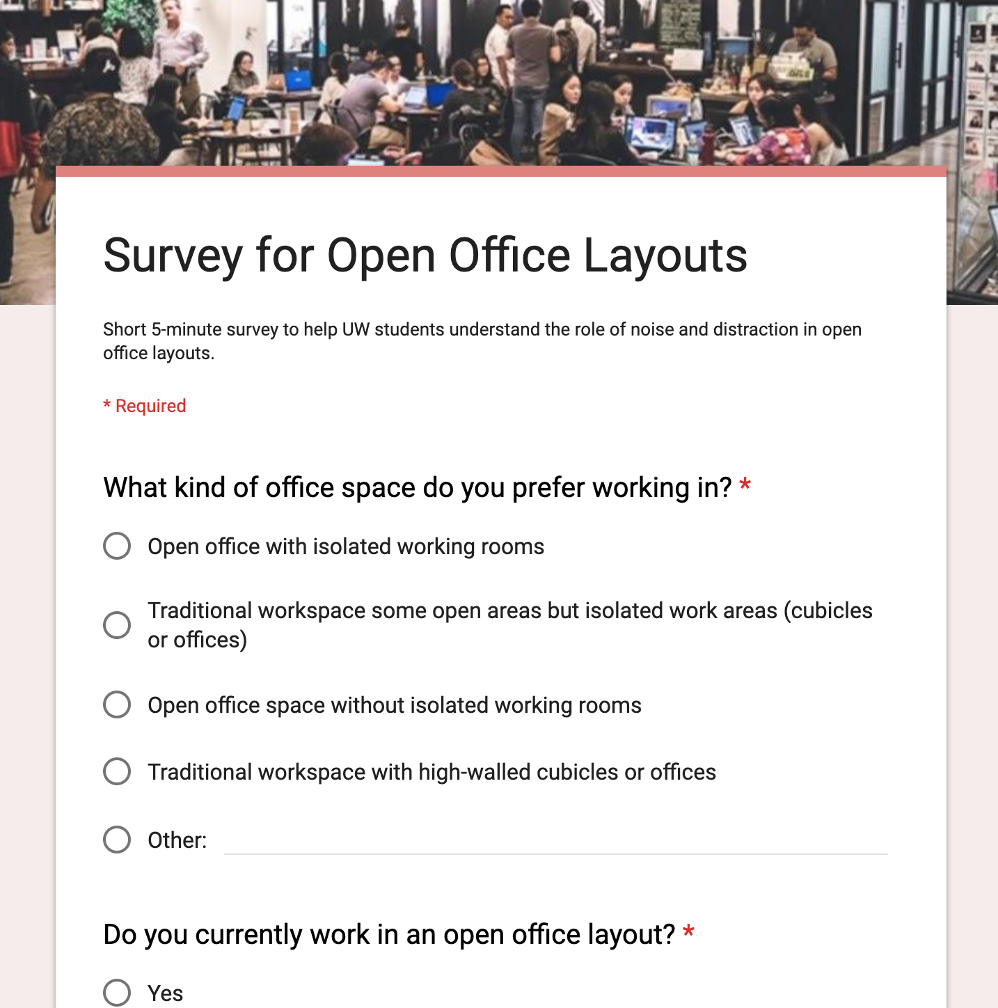
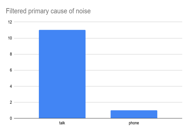
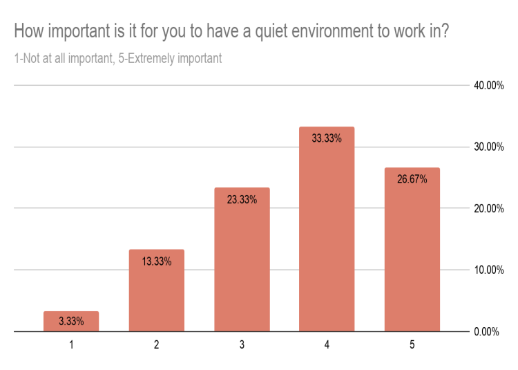
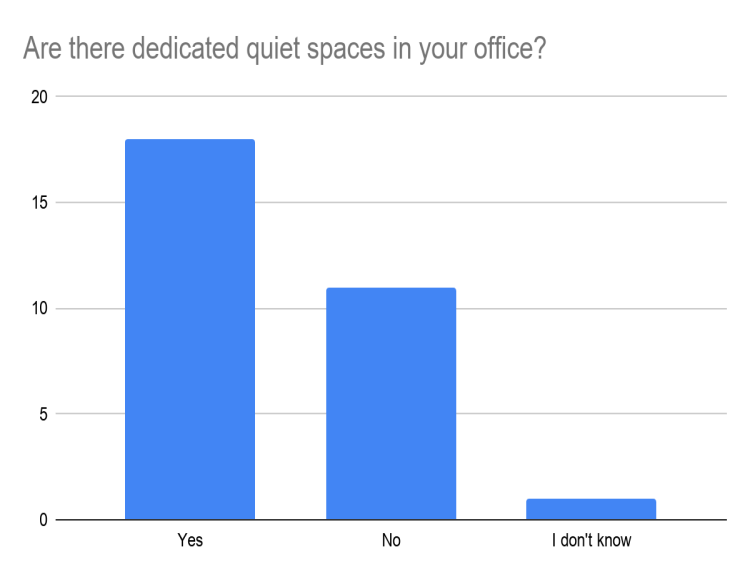
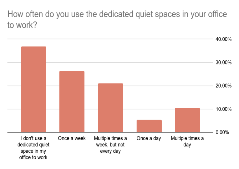
From our survey, we leaned that
- Talking is the primary cause of noise in their office space
- More than 50% of respondents think it’s important to have a quiet environment to work in.
- 19 (63%) respondents said that there are dedicated quiet spaces in their office.
- In 19 respondents to the above question, about 63% of them use dedicated quiet spaces to work each week.
What I’ve learned
Before observation, I thought this process would be very embarrassed. But as we were observing an open office coworking space, for the most part we just blended in as “just another company doing some work”. I was surprised how many insights were able to gather from observing people and immersing ourselves into the environment. I believe I’ll do more observation for upcoming projects. I also learned how to formulate a good survey question and how to be clear and precise in a survey.
Requirements Phase
After conducting our secondary and primary research, we gathered both qualitative and quantitative data. Consolidating all data, we came up 16 design requirements across Business, Technology and Experience aspects. We also ranked them with different priorities as it was really hard to figure out a solution that can meet all requirements.
- Our solutions should be adjusted in time based on the characteristics of the employees and the nature of their work. [BS] [Priority: Low]
- Our solutions should be effective in the long-term within an existing work environment. [UX] [Priority: Low]
- Our solutions should encourage workers to be vocal about their issues with distracting noise. [UX] [Priority: Medium]
- Our solutions should be less than the cost of an open office layout. [BS] [Priority: High]
- Our solutions should allow employees to communicate while still blocking distracting noise. [Tech] [Priority: High]
- Our solution should encourage employees to take advantage of the company’s existing noise reduction resources. [UX] [Priority: Medium]5
- Our solution should leverage existing company resources. [BS] [Priority: High]
- Our solution should use noise reduction materials to enhance noise reduction effectiveness. [Tech] [Priority: High]
- Our solution should make the layout of the open office more reasonable and innovative. [BS] [Priority: Medium]
- Our solution should be generic enough to be applicable for all office layouts. [Tech] [Priority: Medium]
- Our program needs to meet the individual needs of employees. [UX] [Priority: Low]
- Our solutions should balance employee privacy and teamwork requirements. [UX] [Priority: High]
- Our plan should help the company better understand employees’ troubles with noise problems. [BS] [Priority: Medium]
- Our solution should be able to help reduce distracting noise with the help of technology. [Tech] [Priority: Low]
- Our solution should be versatile enough to be useful to the majority of employees. [UX] [Priority: Medium]
- Our solution should be easy for employees to utilize. [UX] [Priority: High]
We also decided to make our design question more generic in order to target both of our market subsegments.
What I’ve learned
If we were able to refine those requirements, make them less redundant and prioritize them more reasonably, it would be much easier for us to brainstorm.
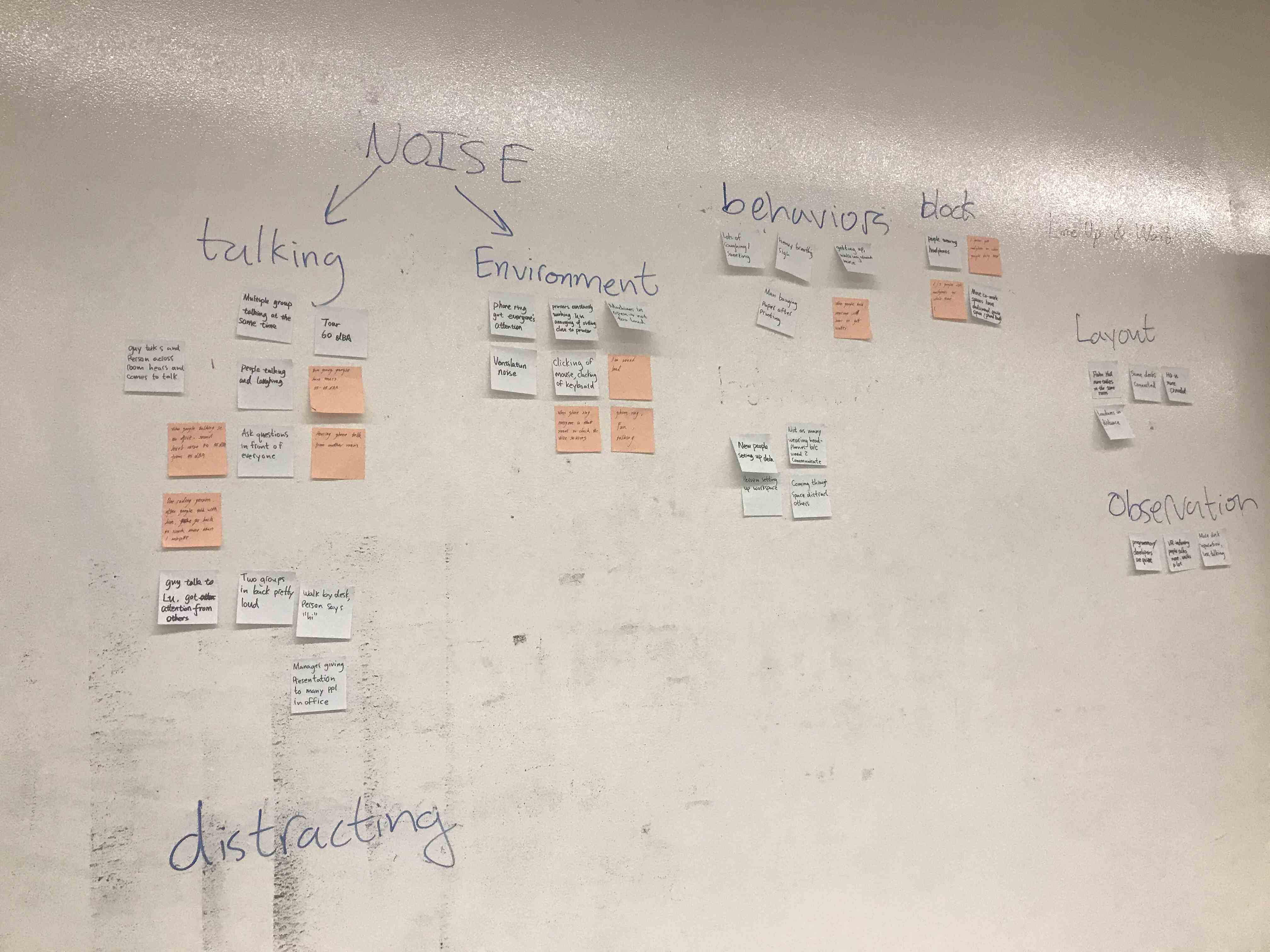
It was also my first time using affinity diagram, I first found it not that helpful. But when we have gather a large number of insights from our survey and field observation, affinity diagram helped me to group insights and derivate problems and requirements.
Ideation
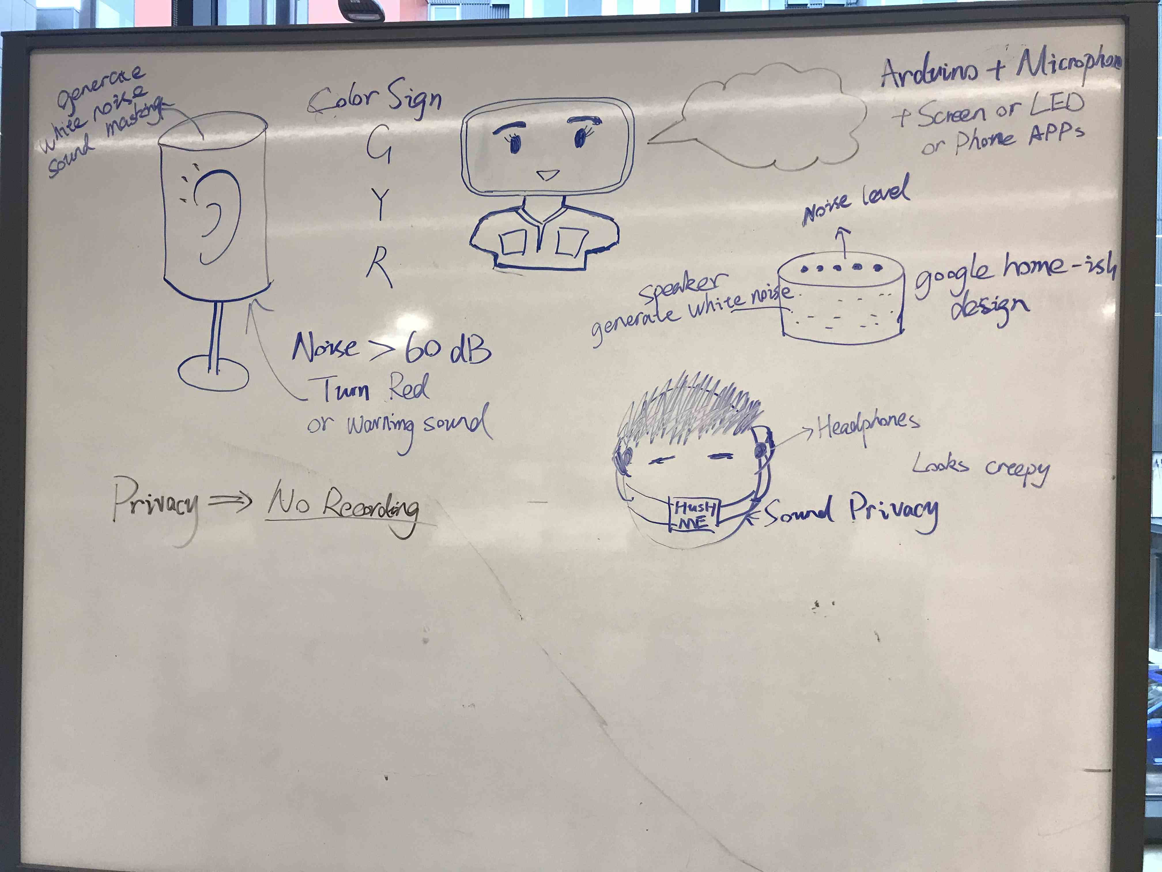
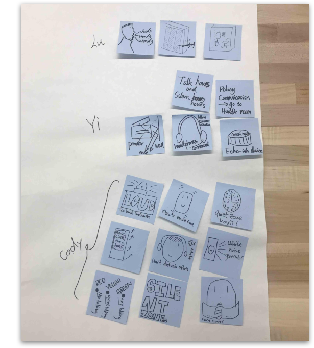
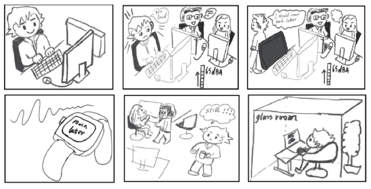
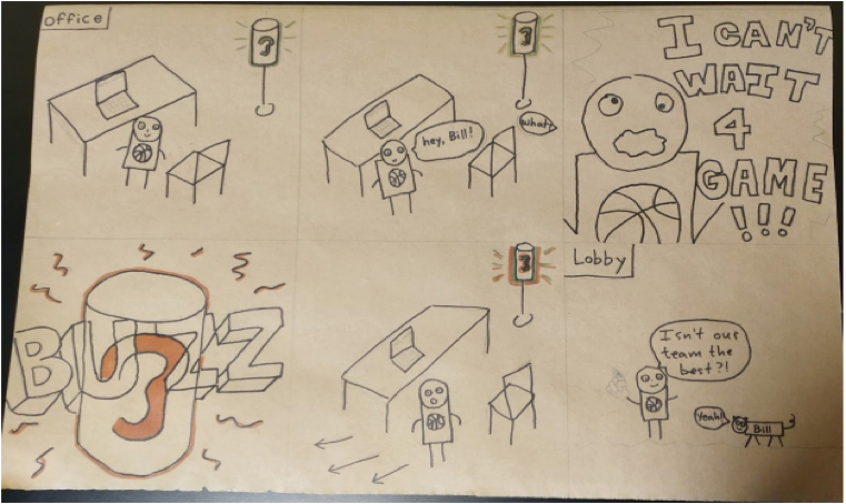
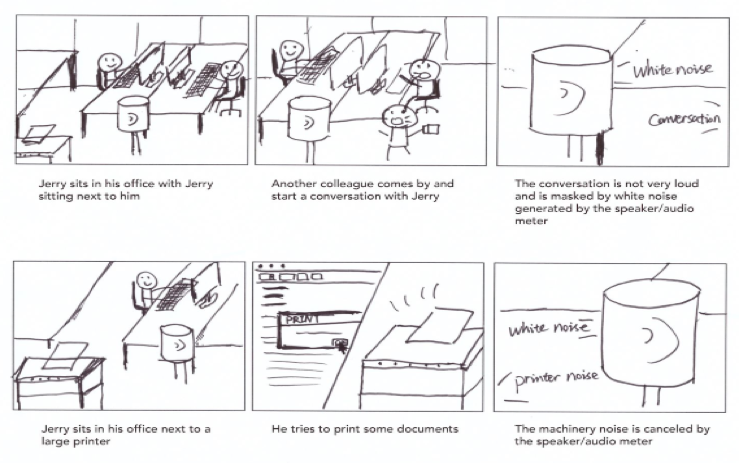
Based on our requirements and their priorities, we decided our core design requirements and then started our brainstorm by drawing stuff on both post-it and whiteboard. We also make our user scenarios and storyboard with different possible solutions including
- Sound Masking
- Hush Me (a personal acoustic device that protects speech privacy and reduce noise pollution)
- Sound Meter
We ended up deciding to use the Sound Meter solution since that’s the most effective and possible solution for us and we have already got our circuit playground board which has its microphone and led built-in.
After this decision, we also discussed deeper about how this device can interact with our user and how can this device prevent noise pollution from people talking in the office.
What I’ve learned
Making core requirements can really help us narrow down our solution set or even direct us to a point-blank solution. It is very important to take notes or take pictures to record our ideas while brainstorming, otherwise it would very easy to forget some awesome ideas that are mentioned earlier.
Prototype & Evaluation
Our prototype consists of one 3D printed noise meter and a mobile phone app. We produced the hardware device using rapid prototyping and would consider it to be a low to medium fidelity rendering, given it produces the required functionality using simple off the shelf components and simplifications to the overall design. Our mobile phone app is a medium fidelity prototype given it works on an actual phone and was built using Adobe XD, a user experience design tool.
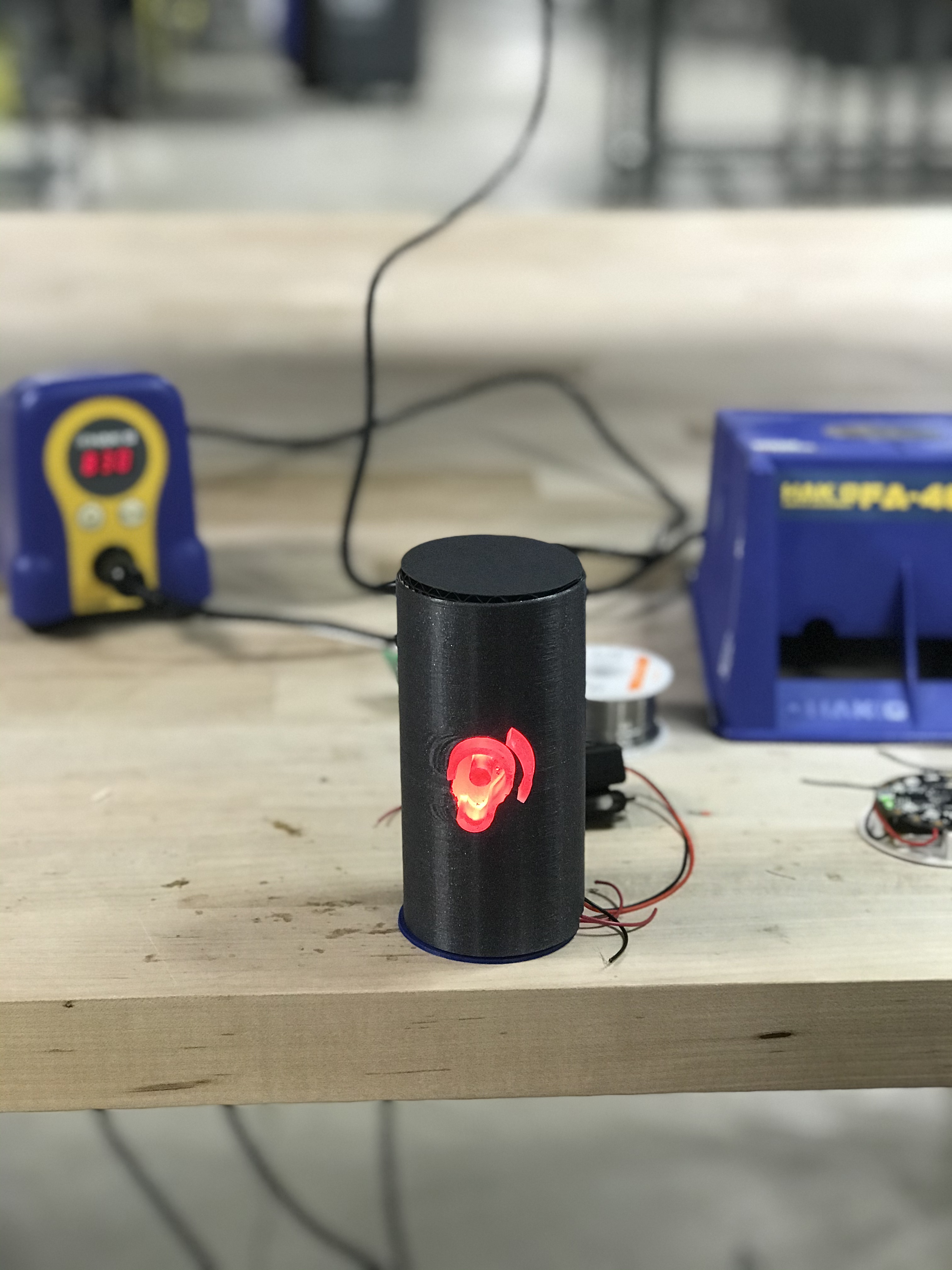
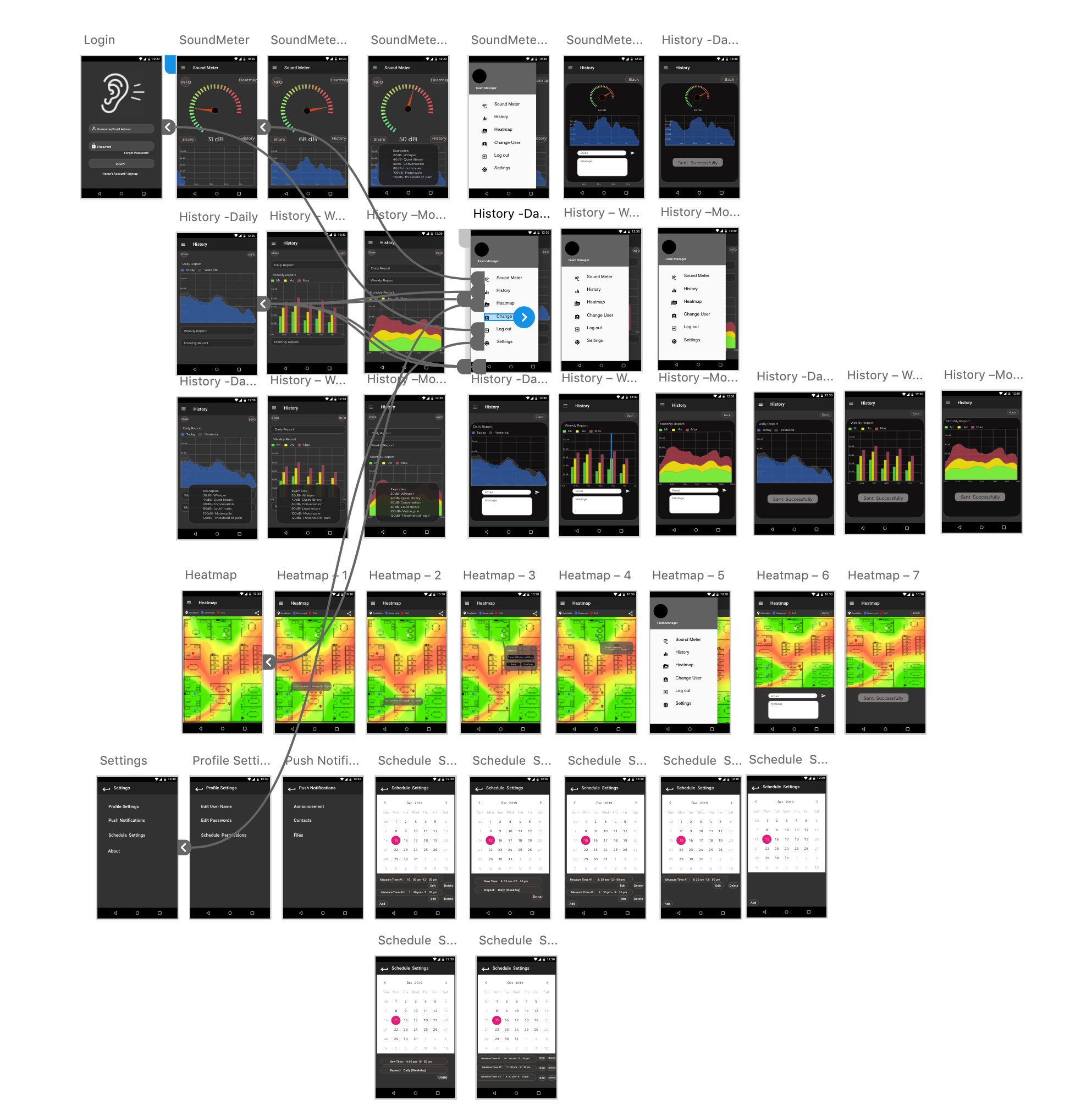
The primary learning objective of our study is to better understand how users respond to noise visualization. In one scenario users responded to the device we created; this device can help users become more aware of their own volume level and that of potential noise sources around them. By understanding if this device can minimize noise created in users’ environments, we know that using this device reduces the amount of distracting noise in a given environment. We also created an application interface which allows users to see a “noise map” of their work environment and use their device to interpret and share noise information.
As stated in our purpose we have two main ways of testing users’ responses when they see visualized noise information; these visualization technologies are a device which sits on the user’s desk, and a mobile application which lives on the user’s phone. The main characteristics we wanted to test for were if the desktop device and mobile application could be successful at curbing overall noise in an open office layout, if the mobile application’s features would prove useful and acceptable to the user, and what potential concerns the user might have over data and privacy. These three characteristics are measured using the user’s response to questions we created to understand qualitatively what the user is thinking about these devices.
All of our study participants were students from GIX Cohort 3. We have 3 rounds and each round lasted about 25 minutes.
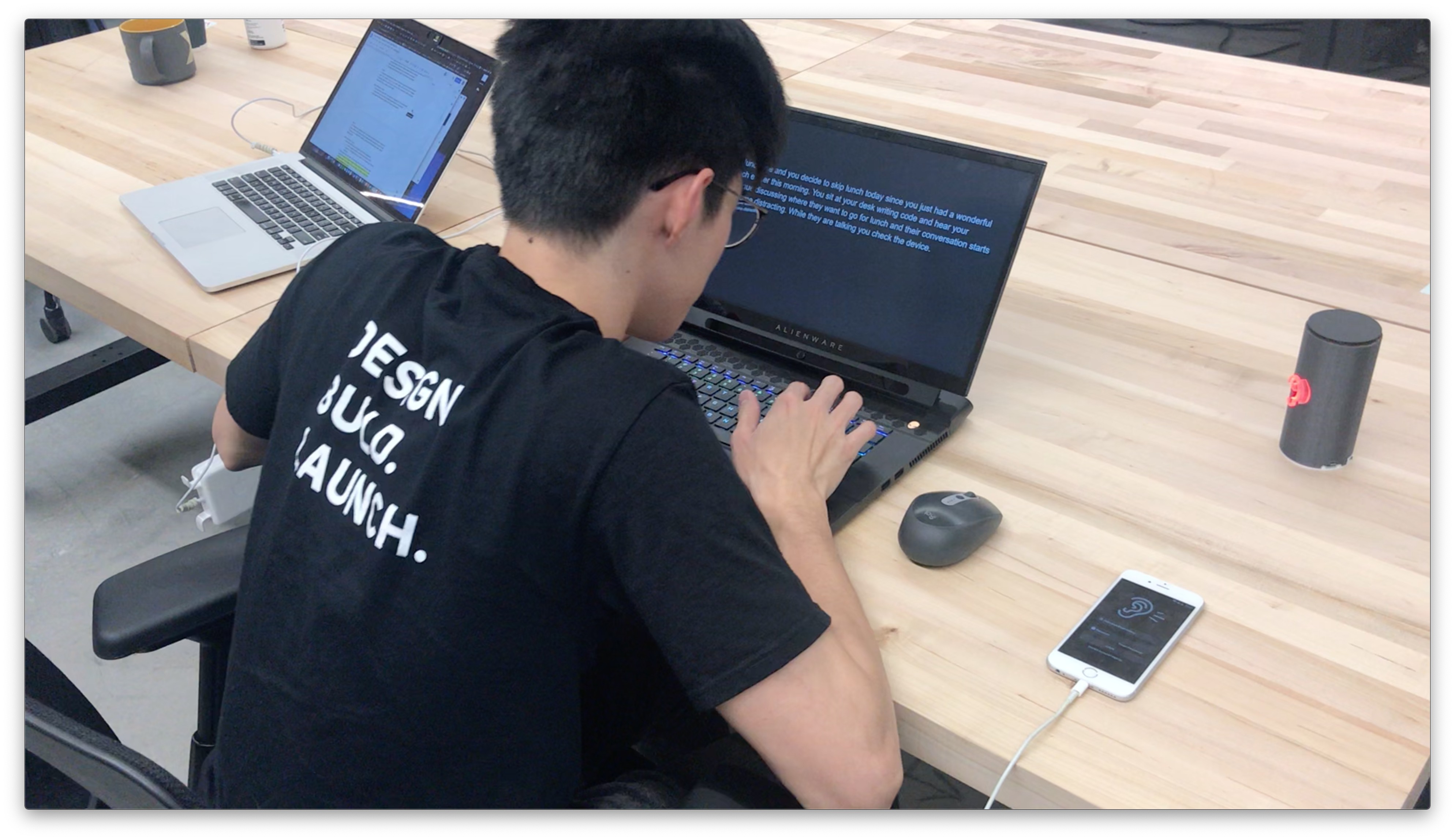
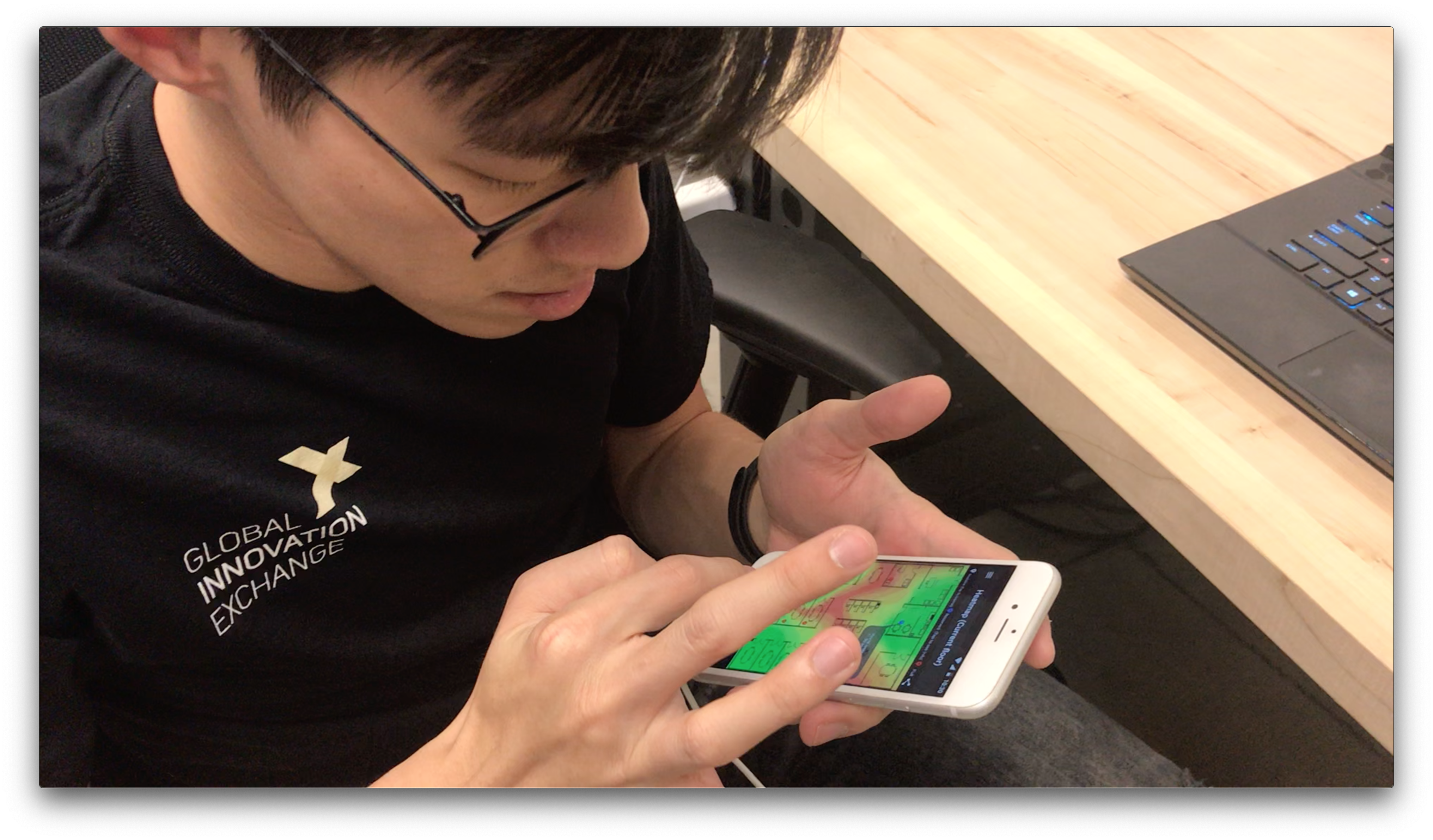
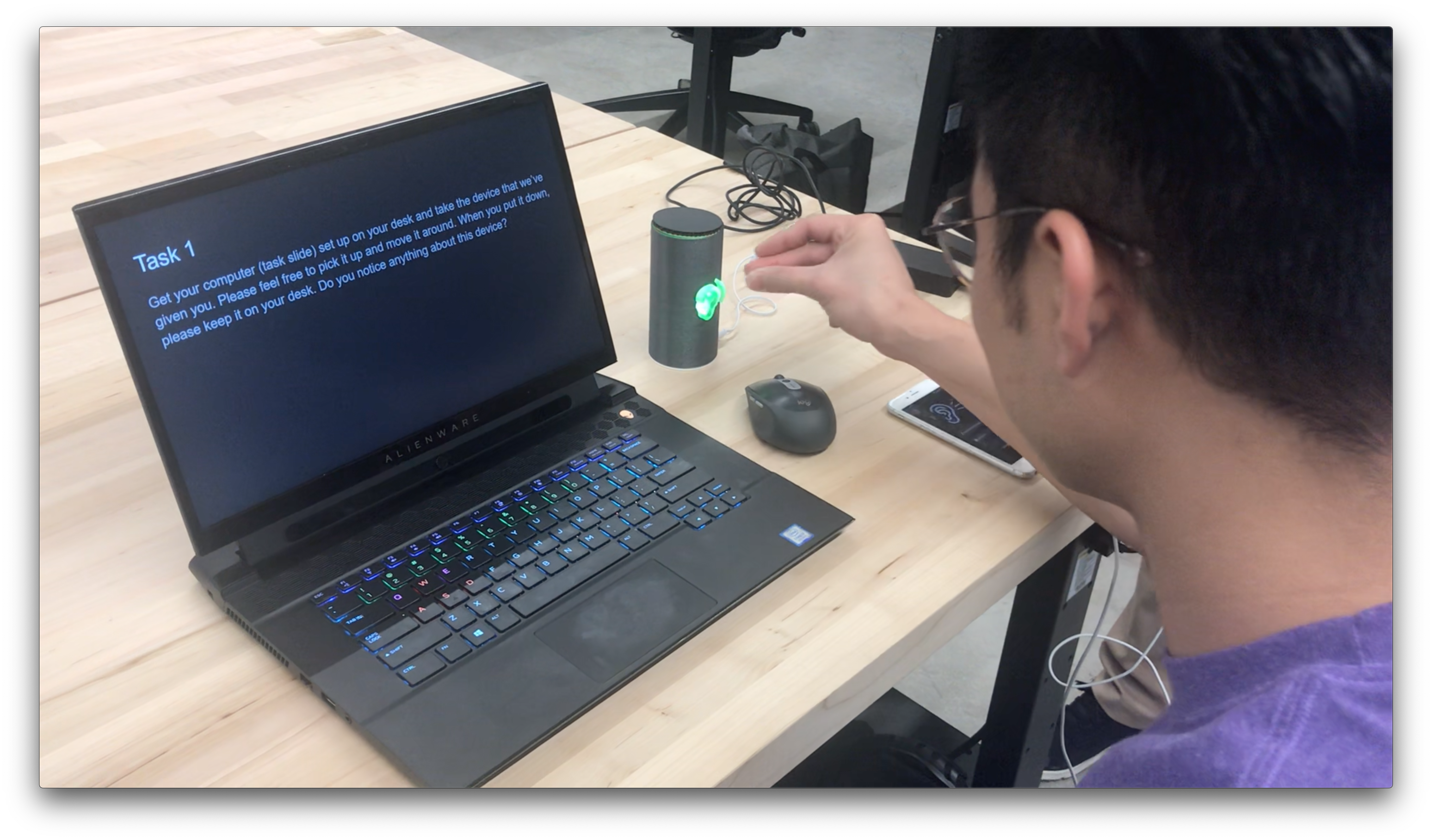
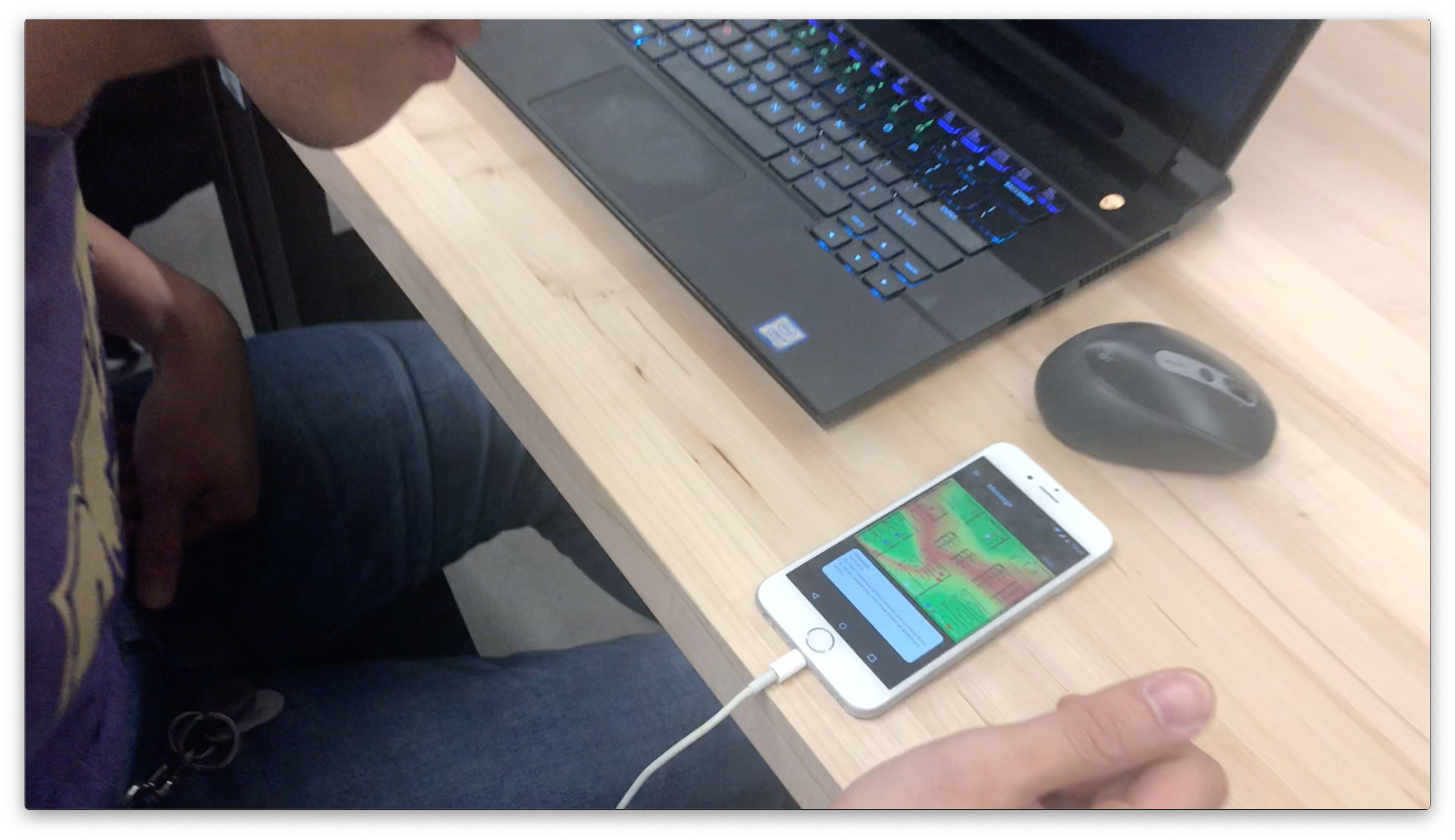
Link to the test video: YouTube Link
From the evaluation, we got some usability findings:
- Only use the lights on our device when there is noise (turned off when there is no noise)
- Adapt the software on our physical device to better recognize human conversation sound and volume levels
- Notify the correct person with data about noise levels in the office
- Train users about this device so they understand what it is, how to use it, and how it affects their privacy
- Create better organization for application’s data collection and display
Overall Reflection
At the end, we are very happy with and proud of what we have achieved and what we have made. As a team of three engineers, we have gone through a lot of process that we have never experienced before. We were always excited about the possibilities of a solution, so it was very easy to come up with a solution first and work towards that solution directly without really thinking about the problem first.

During the entire design thinking process this quarter, instead of a linear process, we have to adapt, self-correct and quickly respond to new facts we found throughout the entire design process.
We have to the realize that problem is always changing and there is no such a thing as a definitive solution.
I think the goal of the entire design thinking experience is not about the solution, instead, it is an experience about finding a problem, refining a problem or even discover some unexpected findings or problems during this process.
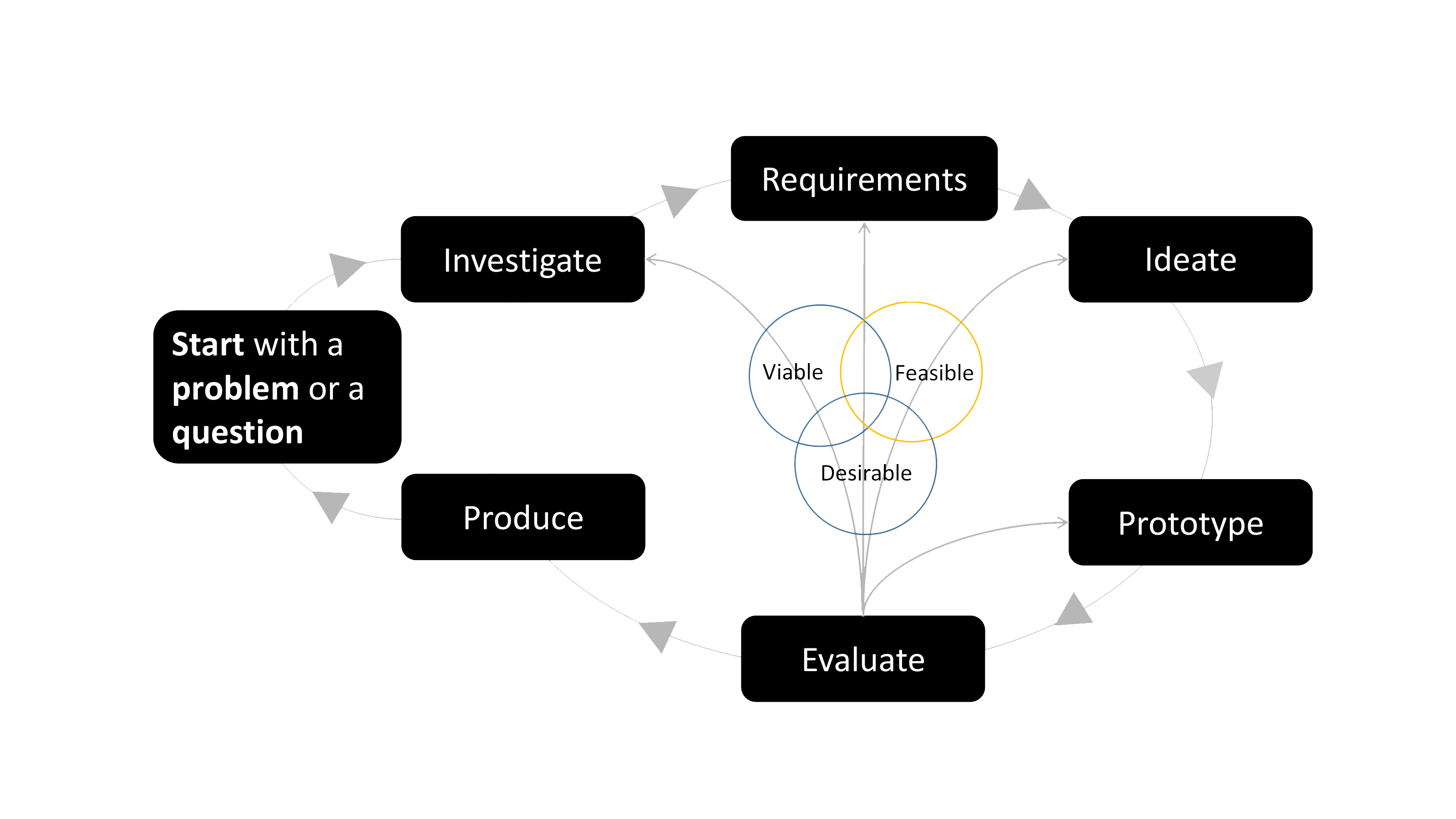
Requirements were more difficult. As we’re all engineers I think it would have been nice to take more of a Continuous Integration approach to our idea. With more time we could iterate on our idea and have multiple evaluations which could feed back into our investigations and requirements. For the time we did have though we’re able to foster great feedback. It teaches us that you can get a lot of value using the design thinking process without requiring tons of resources (our main resource in this case was just time). I would consider this a first iteration; I think having three field observations and three user studies is what gave us the ability to really verify if our idea would work or not. Doing this in a company could be key to understanding if requirements of users are really being met for a given problem.
Also, we found that the most of the valuable information comes from direct interaction with users. Through deep engagement with users, we received many insightful responses that are way beyond expectations.
Evaluation is a key step, we would revisit time and again / while we’re developing our product / to ensure we are solving the problem and fulfilling the user’s requirements.
All in all, we have following key takeaways from the entire design thinking process:
- Delay coming up with a solution
- Ensure you have access to your population and meet with them early on
- Reading secondary sources helped us focus in on an issue, but it was completely different to see the problem firsthand through our field study
- It is good to iterate with direct interactions with a small audience first to gauge whether your solution is viable; it will give you a lot of valuable qualitative information